

Pilots who rely on NOAA’s aviation weather products are getting two significant upgrades this spring. The agency launched a new forecast system for icing and turbulence in late March, and it is rolling out a redesigned Graphical Forecast for Aviation (GFA) interface on May 4. Together, the changes deliver more precise hazard data and a cleaner way to access it.
A New Forecast Engine Under the Hood
The bigger change happened behind the scenes. In late March, NOAA activated the Domestic Aviation Forecast System (DAFS), a new weather model that replaces the previous system used to generate icing and turbulence guidance for the continental United States.
The old system ran on a 13-kilometer (about 8-mile) surface grid. DAFS uses a much higher-resolution model — 3 kilometers — updated every hour. That means the icing and turbulence forecasts pilots see during preflight and in-flight planning are now far more detailed.
The icing component provides improved forecasts of icing probability, severity, and supercooled large droplet (SLD) conditions. SLD icing is particularly dangerous because it can form beyond the protection of standard de-ice and anti-ice systems.
The turbulence side got a meaningful upgrade too. DAFS now predicts clear air turbulence, mountain wave turbulence, low-level turbulence, and turbulence within cloud systems — from small storms to large weather complexes. The previous model handled fewer turbulence types with less granularity.
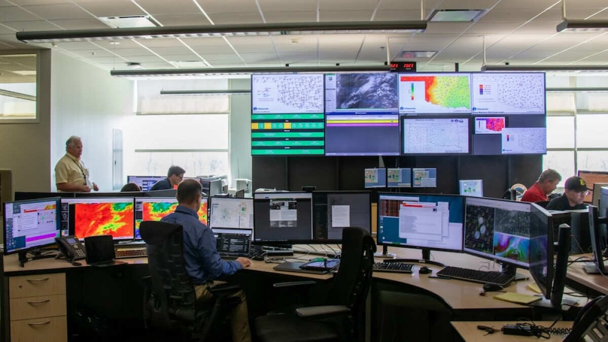
The FAA’s Aviation Weather Research Program funded the development. NOAA meteorologists at the Aviation Weather Center in Kansas City and at the FAA’s 21 Air Route Traffic Control Centers use this data to create the forecasts and warnings pilots see on aviationweather.gov, in EFBs like ForeFlight, and through flight service briefings.
The GFA Gets a Fresh Interface
Starting May 4, the Graphical Forecast for Aviation web page at aviationweather.gov is getting a visual and functional overhaul. The core data is not changing — pilots will still find the same weather layers for clouds, flight categories, precipitation, icing, turbulence, and winds. But how you interact with that data is getting noticeably better.
Here are the key changes:
The level slider now shows accurate vertical spacing that reflects actual altitude differences. It also includes a dynamic height label that updates as you scroll and a toggle for Low Altitude mode built right into the slider.
The time slider now integrates the extended range toggle directly, so switching between observation and forecast periods is simpler.
Weather parameters that used to live in a dropdown menu are now accessible as one-click tabs. That means switching between, say, icing and turbulence views takes a single tap instead of navigating a menu.
New range rings let pilots focus on a specific area by searching for a station and setting a radius in nautical miles. The rings stay fixed as you pan the map.
Satellite views now include color infrared imagery. Wind maps can display “streamlines” that show general wind flow direction. And for the first time, gridded data layers show numerical values on the map — you can see actual ceiling heights, visibility numbers, or turbulence intensity values overlaid on the color grid.
NOAA said the changes were driven by public feedback on how to make the GFA more useful.
Why This Matters for Pilots
Aviation weather is the foundation of every preflight briefing. Whether you are a student pilot planning a local cross-country or a commercial crew evaluating a route through the Rockies in winter, the accuracy and clarity of icing and turbulence information directly affects your go/no-go decision.
The DAFS upgrade means the data itself is better. Higher resolution means the difference between “there might be icing somewhere in this large area” and “icing is expected at this altitude in this corridor.” That level of precision gives pilots more options to route around hazards instead of avoiding an entire region.
The GFA redesign means the data is easier to use. Pilots who have struggled with the old interface — hunting through dropdown menus or squinting at color-coded grids without numerical labels — should find the new layout faster and more intuitive.
Both upgrades also feed into third-party apps. ForeFlight recently highlighted that its U.S. icing and turbulence map layers now use the higher-resolution DAFS data at 3-kilometer scale, replacing the old 13-kilometer model. Pilots using EFBs may already be benefiting from the improved data without realizing the source changed.
What to Do Before May 4
If the GFA is part of your preflight routine, take a few minutes after May 4 to explore the updated interface. The core information is the same, but buttons, sliders, and menus have moved. NOAA has posted a detailed overview of the changes at aviationweather.gov/help/upcoming.
Bookmarks to specific GFA pages should still work. But if you have saved shortcuts to older interface elements, double-check that they still point where you expect.
The upgrade is a welcome step. Better data and a cleaner interface mean less time interpreting weather and more confidence in what it is actually telling you.


You must be logged in to post a comment.